We bring fresh color and lasting quality to every project - interiors, exteriors, and cabinetry included.
Get a clear, detailed free estimate from our house painters near you, serving all of New Jersey.
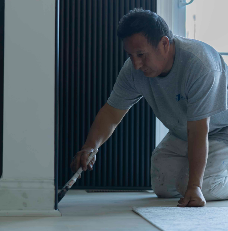
Explore our painting services in Alpine, NJ


Expert Painting Services near Crystal Lake, NJ
For more than two decades, Jordan Paintings has proudly served homeowners throughout Crystal Lake, delivering top-tier residential painting that enhances every home’s character. From charming colonial-style houses along Crystal Lake Drive to modern residences near the lakeshore, our team understands the unique styles and needs of this vibrant community. Our reputation for reliable, friendly service combined with lasting quality makes us a trusted choice for local homeowners seeking beautiful, durable finishes. We’re passionate about helping Crystal Lake residents protect and improve their homes with expert craftsmanship and personalized care.
When you choose Jordan Paintings for your Crystal Lake home, you benefit from:
- Local Expertise: Our extensive experience with Crystal Lake neighborhoods ensures we know what works best for your particular property and architectural style.
- Specialized Craftsmanship: We focus solely on residential painting, using high-quality materials and techniques tailored to withstand Crystal Lake’s weather and preserve your home’s beauty.
- Trusted Reputation: Countless Crystal Lake homeowners have relied on us for dependable service, consistent results, and transparent estimates that respect your budget.
Get Your Free Estimate Today!
Ready to refresh your Crystal Lake home? Contact Jordan Paintings for a no-obligation estimate. Call us at (973) 798-9412 or email info@jordanpaintings.com. You can also visit our website to learn more about our local expertise and quality workmanship. Let us bring new life to your home with trusted, professional painting services tailored to Crystal Lake’s unique character.


Our process is simple and effective
Tell us briefly about your painting project needs.
Let's arrange a convenient time for an on-site visit, discuss details, and provide your free estimate.
Once approved, our expert team completes your painting project.
Why choose us?
We've spent the last 20 years bringing house painting perfection down to a science, built to withstand demanding New Jersey weather.

Eco friendly
We prioritize your well-being and the environment. Contact us to learn more.
Done with love
Our passion for painting shines through in every project.
Cost-effective
Premium painting services that deliver quality and lasting value.
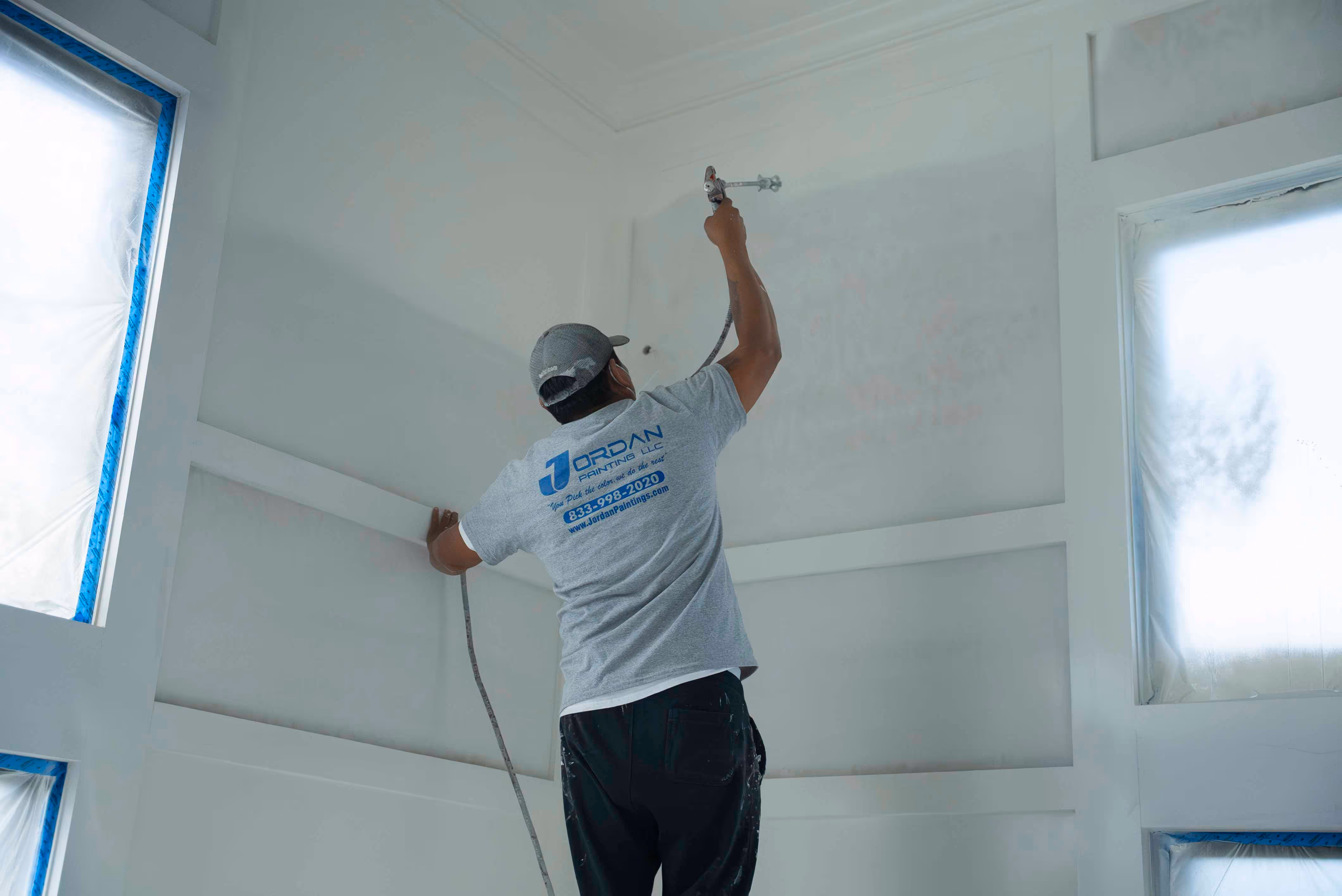
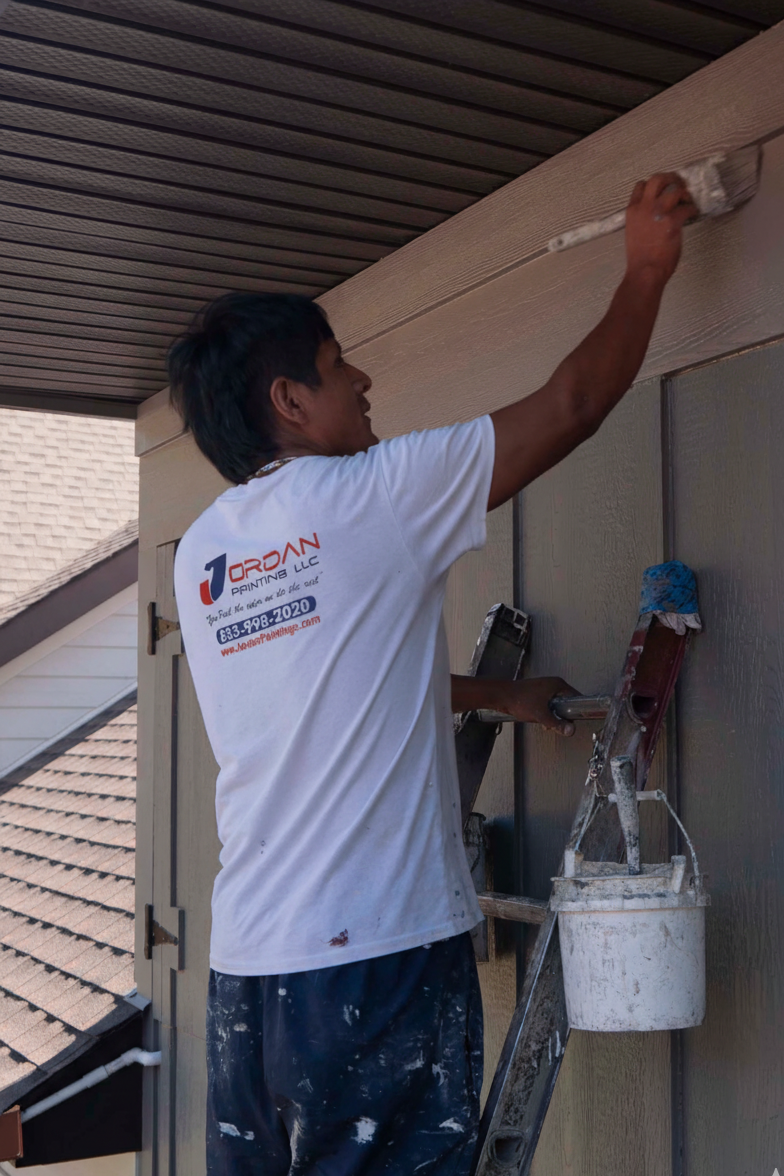
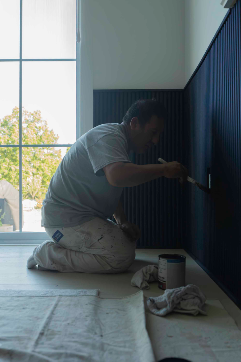
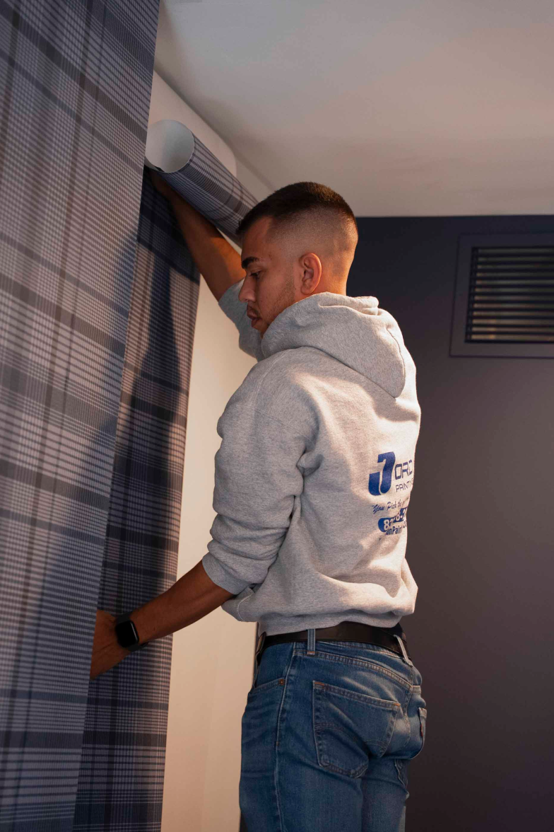
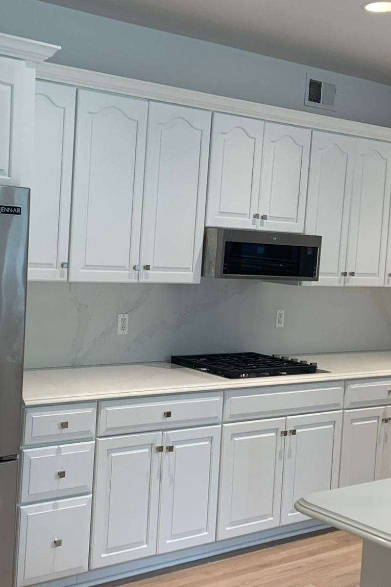
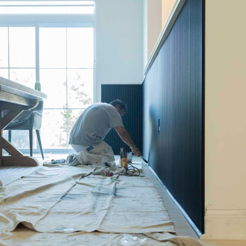
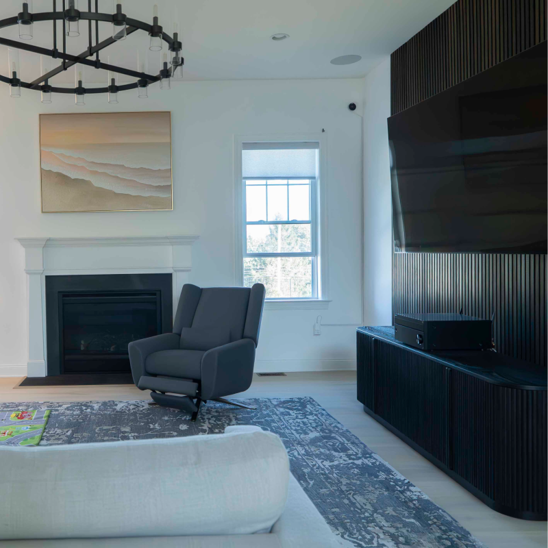
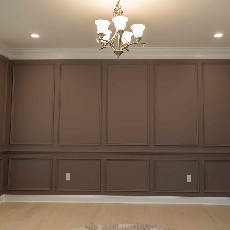
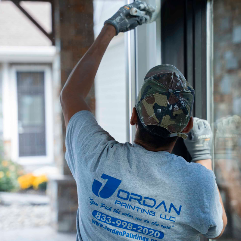
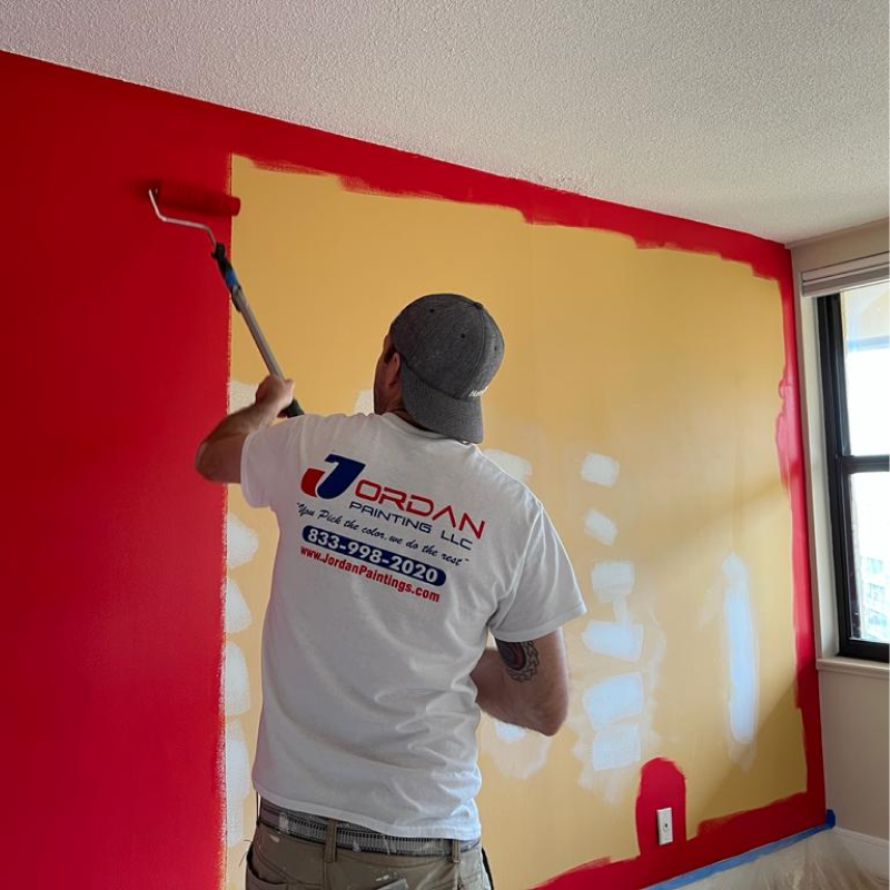
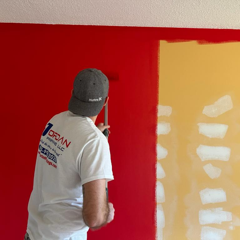
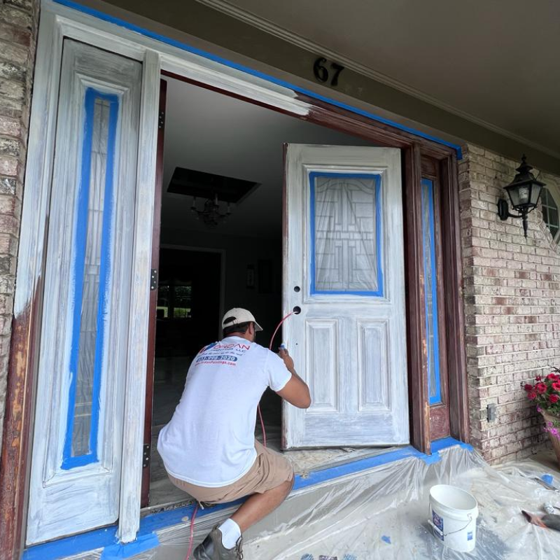
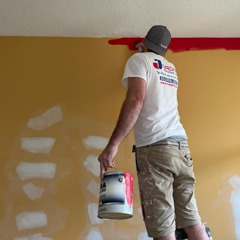
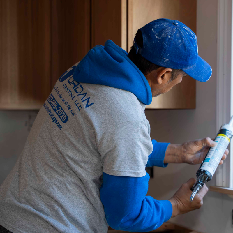
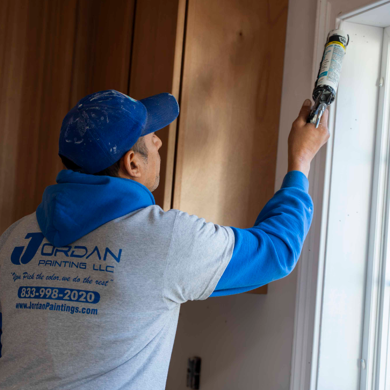
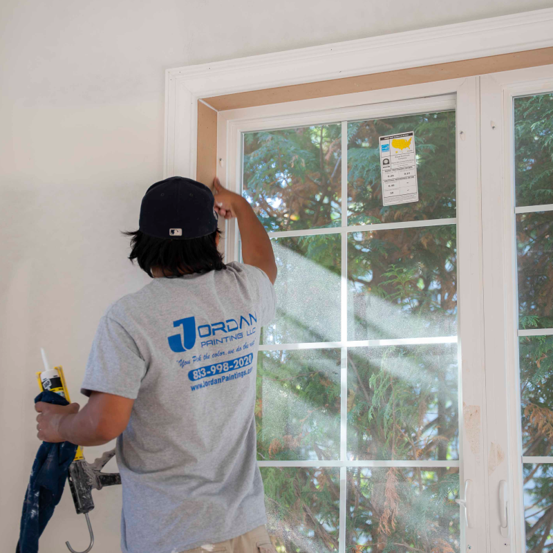
Our past projects of painting work
Discover the quality and craftsmanship of Jordan Paintings through our diverse portfolio of completed projects across New Jersey.


Reach out to us
Have a question about your next painting project in New Jersey? We're here to provide answers, offer expert advice, and schedule your free estimate.
Send us a message
Send us your questions or project details, our team will get back to discuss your painting needs.
Give us a call
Give us a call for immediate assistance or to book your free painting estimate in New Jersey.
Have questions?
Paint shades can vary significantly based on illumination sources (daylight vs. electric, warm vs. cool lighting), adjacent colors, wall texture, and existing base color. Always trial paint samples directly on your walls and review them throughout various times of day before finalizing your choice.
Eggshell and satin sheens rank as top choices for interior wall surfaces - they provide gentle luster, simple maintenance, and conceal small flaws. Choose flat/matte for overhead surfaces and minimal-use spaces. Semi-gloss suits trim, doorways, and humid environments including bathrooms and kitchens where resilience is essential.
Warm white options contain yellow, cream, or pink tones creating an inviting, comfortable atmosphere. Benjamin Moore's White Dove exemplifies this category. Cool whites feature blue or gray bases delivering a fresh, contemporary feel. Chantilly Lace represents cool whites well. Your selection should align with your space's natural lighting and current decor.
Top-selling interior shades include cozy neutrals such as Sherwin Williams' Agreeable Gray and Benjamin Moore's Revere Pewter. These adaptable greige (gray-beige blend) tones complement various furniture designs, floor materials, and lighting scenarios while delivering elegance and comfort.
Professional designers typically suggest 3-5 shades to create a unified interior scheme: a primary neutral covering the majority of walls, one to two statement colors for accent walls or designated areas, plus a uniform trim shade used consistently. This approach establishes continuity throughout your home while giving individual rooms distinct personality.
Begin by examining your room's permanent features (floors, counters, or primary furnishings) to determine their underlying tones. Select paint shades that harmonize with these undertones. Apply the 60-30-10 design principle: 60% primary shade (wall surfaces), 30% supporting colors (upholstery/fabrics), 10% highlights. Our preview tool allows you to experiment with color pairings before purchasing.
Pale, cool-toned shades including whites, gentle grays, and soft blues expand a room's perceived size by bouncing light and creating visual depth. Benjamin Moore's Chantilly Lace and Sherwin Williams' Pure White work exceptionally well. Applying identical colors to walls and trim removes visual interruptions, maximizing the feeling of openness.
Classic design favors bright white or cream trim that's lighter than walls, establishing crisp definition and enhancing wall color richness. Contemporary styles, however, also welcome matching trim and wall colors for a smooth, modern aesthetic, or darker trim for striking visual impact.